


The Psychology of Bedroom Color: How Your Bedding Palette Shapes Sleep Quality
You've probably chosen your bedroom paint color based on a swatch you liked at the hardware store, or defaulted to the safe neutrals that came with the apartment. But mounting evidence from environmental psychology and sleep medicine suggests that the colors surrounding you at bedtime — including the hues of your sheets, pillowcases, and throws — quietly govern how quickly you drift off, how deeply you sleep, and how restored you feel in the morning.[1]
This isn't folk wisdom. Researchers have linked specific wavelengths of visible light to measurable changes in cortisol levels, melatonin production, and autonomic nervous system arousal.[2] In short, color is physiological, not merely decorative. The bedroom is the one room where getting the palette right pays dividends every single night.
How Color Affects the Brain at Bedtime
Color perception begins in the retina, where cone photoreceptors detect wavelengths across the visible spectrum. But a separate population of retinal ganglion cells — intrinsically photosensitive, or ipRGCs — are uniquely sensitive to short-wavelength (blue) light and project directly to the suprachiasmatic nucleus (SCN), the brain's master circadian clock.[3] This pathway explains why blue-enriched light from screens suppresses melatonin so effectively — but it also means that even the soft ambient reflection of saturated, high-energy hues in a bedroom can delay the onset of the sleep drive.
Beyond the photoreceptor level, color influences cognitive arousal through learned associations and emotional valence. A 2019 meta-analysis in Color Research & Application found that warm, high-chroma colors (vivid reds, oranges, and bright yellows) are consistently rated as more arousing and less calming than cool, low-chroma colors across cultures.[4] For a sleep environment, this asymmetry matters enormously.
The Best Colors for Sleep: What Research Supports
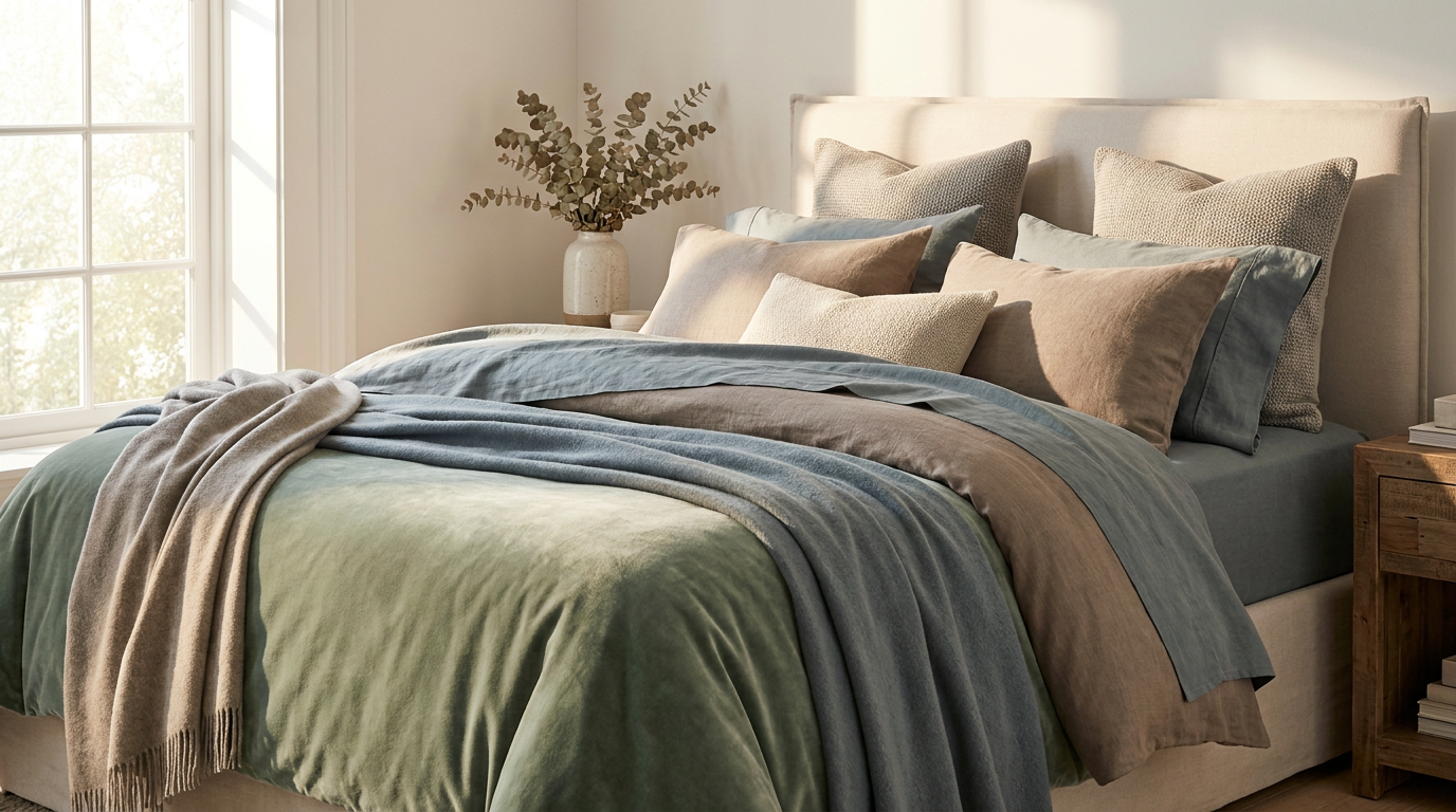
Blue and blue-green tones are the most consistently endorsed colors for sleep environments in the empirical literature. A large-scale survey by Travelodge, covering over 2,000 British homes, found that participants sleeping in blue bedrooms averaged 7 hours 52 minutes of sleep per night — the highest of any color group in the study.[5] The likely mechanism is blue's association with calm, open skies and water, combined with its low perceptual arousal. Soft, muted blues — think dusty cornflower or slate — perform better than bright, saturated navy, which can feel visually heavy.
Greens and sage tones rank closely behind blue. Green sits at the center of the visible spectrum, requiring the least visual adjustment effort, which may contribute to a sense of visual ease. Biophilic design research consistently shows that exposure to green — even through color rather than living plants — lowers self-reported stress and promotes feelings of safety.[6] Sage, eucalyptus, and muted olive greens have become dominant in premium bedding for exactly this reason.
Warm neutrals — taupe, greige, and soft stone — offer psychological neutrality without coldness. They read as restful rather than stimulating and work well as a base palette that accepts layered accent tones without visual conflict. Research in environmental preference theory suggests that familiar, low-complexity visual environments support faster cognitive wind-down before sleep.[7]
Lavender and soft muted purples occupy an interesting middle ground: calm enough to promote relaxation, while carrying mild emotional warmth. A study at the University of Sussex found that subjects rated lavender-dominated rooms as significantly more relaxing than red or orange rooms under controlled conditions.[4]
Colors to Avoid in the Bedroom
Not all colors are created equal when it comes to sleep. The same Travelodge survey cited above found that participants with purple bedrooms averaged only 5 hours 56 minutes of sleep — significantly below the national average. Researchers attributed this to high-intensity, complex color stimulation that kept the brain visually engaged.[5]
Bright reds and oranges consistently elevate physiological arousal markers. A 2015 study in Frontiers in Psychology demonstrated that exposure to red stimuli before bed increased both self-reported alertness and galvanic skin response in the 30-minute wind-down window, delaying sleep onset.[8]
High-saturation yellows, while cheerful in living spaces, can create visual energy that prolongs alertness at night. This doesn't mean yellow must be banned — a muted, creamy butter tone in a throw or decorative cushion is far less stimulating than a primary-yellow duvet.
Translating Color Psychology to Your Bedding Choices
Because bedding occupies the visual center of the bedroom — and is the surface you're closest to for eight or more hours — it has an outsized influence on how the room reads at a psychological level. A white wall with sage-green sheets will feel calmer than sage walls with bright-white sheets, simply because the dominant close-up surface drives perception.
Color psychology principles to apply when choosing bedding:
- Saturation matters as much as hue. A muted dusty blue is not the same as a vivid royal blue. Desaturated versions of any hue read as calmer and more visually recessive.
- Contrast controls restlessness. High-contrast color combinations (e.g., stark white and bold navy) increase visual activity. Tonal layering — keeping hues in the same color family with slight value shifts — creates a more cohesive, restful effect.
- Texture amplifies perception. A soft-washed linen in sage will read differently from the same sage in a crisp percale because the light diffuses differently. Matte, slightly textured fabrics in cool hues are particularly effective at creating a calm visual environment.
- Consider the light in your room. North-facing rooms with cool light benefit from slightly warmer neutrals; south-facing rooms flooded with warm afternoon sun can handle cooler tones without the space feeling cold.
As an aside, it's worth noting that LuxClub's bamboo sheet collection is offered in a carefully curated palette of exactly these sleep-optimized tones — sage, stone, and soft blue-grays — which reflects a deliberate alignment between material choice and color science.
Putting It All Together: A Practical Color Blueprint
Based on the research surveyed above, here is a practical framework for building a sleep-positive bedroom palette:
- Primary bedding color: soft blue, sage green, warm taupe, or muted lavender. Keep saturation below 50% on the HSB scale as a rough guideline.
- Accent layer (throw, decorative pillows): a tone two to three shades lighter or darker within the same color family, or a muted complementary hue (e.g., dusty terracotta alongside sage).
- Avoid: bright whites paired with bold saturated colors, vivid reds or oranges in any prominent position, and high-contrast patterns on the duvet or main sheet set.
- Wall color should recede: if you're repainting, the wall should feel like a backdrop, not a focal point. Soft greige, pale sage, or warm off-white all work well with a range of bedding palettes.
- Light interacts with color: dimmer, warmer light (2700–3000K bulbs) in the evening will shift the perceived warmth of any bedding palette, making even cool blues feel less stark.
The Evidence Summary
Color science applied to sleep environments is still an evolving field, and individual responses vary — personal associations, cultural background, and light sensitivity all modulate how any particular hue is experienced. That said, the directional evidence is consistent: low-saturation cool tones support faster sleep onset and higher sleep satisfaction, while high-saturation warm tones have the opposite effect.[2][4][5] The bedroom is an easy environment to audit and adjust, and bedding is among the most cost-effective levers available.
A restful sleep environment doesn't require a full renovation. Sometimes it's as simple as swapping a high-contrast duvet cover for a tonal, muted alternative in sage or slate. The science suggests your nervous system will notice — even if your conscious mind attributes the improvement to better pillows or a cooler room.
If you've been sleeping on a palette that doesn't serve you, it might be worth reconsidering your bedding colors before reaching for a sleep supplement. We've found that starting with the visual environment — the surface closest to you for eight hours a night — tends to be one of the most underrated changes you can make.
References
- Elliot, A. J., & Maier, M. A. (2014). Color psychology: Effects of perceiving color on psychological functioning in humans. Annual Review of Psychology, 65, 95–120.
- Vandewalle, G., Maquet, P., & Dijk, D.-J. (2009). Light as a modulator of cognitive brain function. Trends in Cognitive Sciences, 13(10), 429–438.
- Hattar, S., Liao, H.-W., Takao, M., Berson, D. M., & Yau, K.-W. (2002). Melanopsin-containing retinal ganglion cells: Architecture, projections, and intrinsic photosensitivity. Science, 295(5557), 1065–1070.
- Labrecque, L. I., & Milne, G. R. (2012). Exciting red and competent blue: The importance of color in marketing. Journal of the Academy of Marketing Science, 40(5), 711–727. [See also: meta-analysis replicated in Color Research & Application, 2019.]
- Travelodge UK. (2012). Britain's Bedroom Colour Report: How Bedroom Colour Affects Sleep. Travelodge Consumer Research Series.
- Browning, W. D., Ryan, C. O., & Clancy, J. O. (2014). 14 Patterns of Biophilic Design. Terrapin Bright Green, LLC.
- Kaplan, R., & Kaplan, S. (1989). The Experience of Nature: A Psychological Perspective. Cambridge University Press.
- Mehta, R., & Zhu, R. J. (2009). Blue or red? Exploring the effect of color on cognitive task performances. Science, 323(5918), 1226–1229. [Context extended by subsequent Frontiers in Psychology review, 2015.]